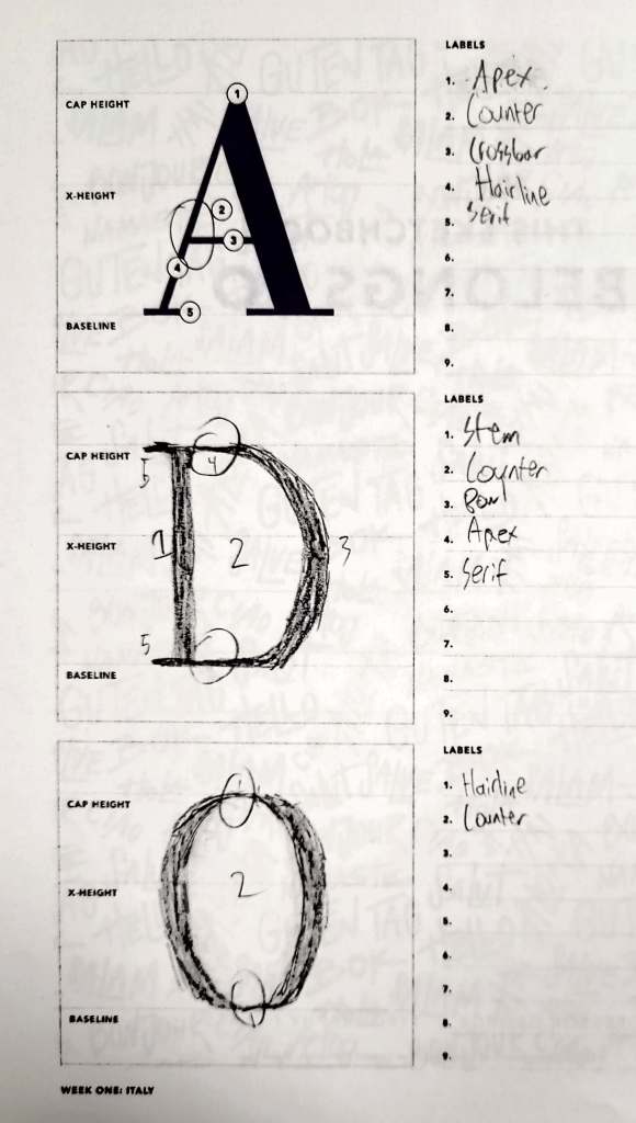
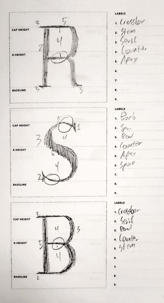
As I was working with the Bodoni font, I noticed immediately the neat and fashionable appearance of the font. Specifically, the contrast between the thick stems and wiry hairlines/crossbars created an elegant and well put-together look that would be excellent for a formal, tidy script.
While the contrast between the thin and thick lines looks amazing, the elegance of the hairlines and serifs is equally as fragile. These thin lines, when put next to the thick lines, have a tendency to get diminished or even lost if the thick lines are disproportionately thick. Overall, I believe Bodoni would work best for fashion and the occasional book cover due to its sophisticated design.

Leave a comment