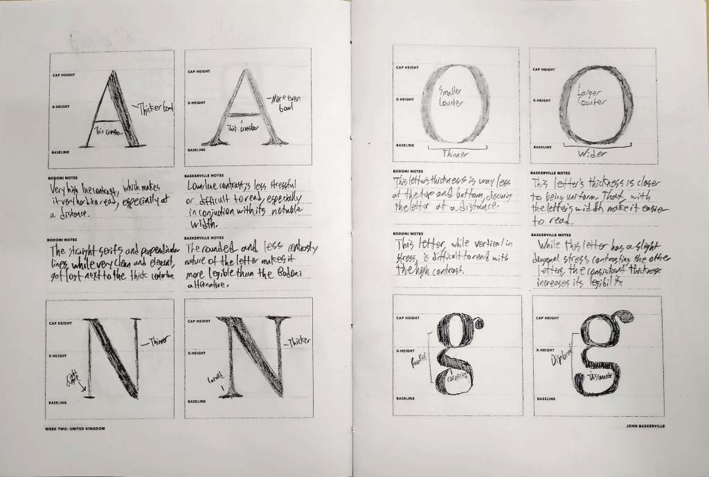
For this entry, the fonts Baskerville and Bodoni were compared side by side. Immediately, one thing is significantly different between the two fonts. This is that Bodoni has a much higher contrast in line thickness than Baskerville. This effectively makes Baskerville a considerably easier font to read and considerably more applicable font, as Baskerville’s consistency balances out its design. Along with this, Baskerville has a tendency to be wider and have curved, more defined serifs than Bodoni, which is smaller in width and lacks any kind of curves in the serif. This gives a certain space to Baskerville that allows it to fully utilize its consistent-ish line width that Bodoni simply does not have.
In the end, Baskerville is the clear winner in readability. So, naturally, that means that it should automatically be used over Bodoni, right? Not necessarily. While Baskerville is generally more readable, it lacks a certain level of style that Bodoni has. As a trade-off for the wider sizing and more consistent linewidths, Baskerville has sacrificed the artistic appeal that Bodoni might have through its contrast and sleek design. In the end, both of these fonts have their own set of uses unique to themselves despite their immediate similarities.

Leave a comment