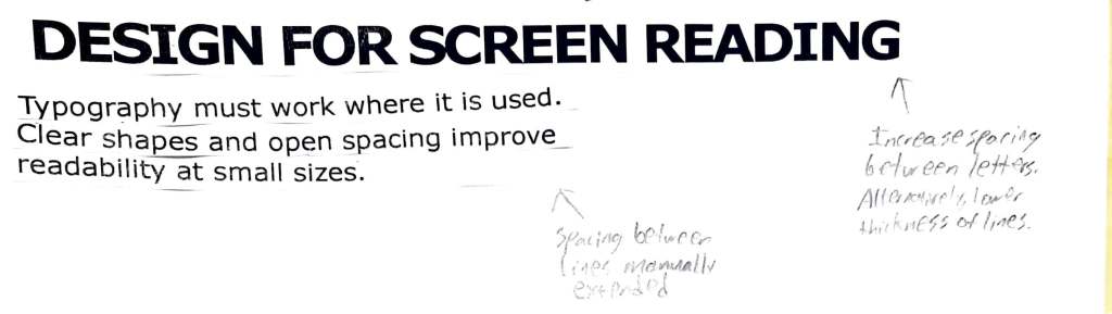
For this assignment, I picked two pieces of text that had some sort of typographical errors and rearranged them on a separate paper. For my sheet, I chose one heading and one body paragraph. To begin with, the heading has an unfortunate case of bad kerning. In this heading, the letters are uncomfortably close together. Not only is this true, but certain letters, such as I’s and E’s, look weird with the current kerning as they don’t touch with the other letters like most of the other letters do. Overall, the kerning is a blasphemous mix of too close and somehow too far. This is why I wrote the annotation recommending to adjust the spacing between letters, as something as simple as increasing this space slightly could break the bad design that was put in place for the heading.
Next, the paragraph was adjusted. Initially, the vertical spacing between the lines in the paragraph was very close to the point where letters almost overlapped vertically. On my sheet, I manually cut horizontal lines and spaced out each line vertically by hand as indicated by my other annotation. This increase in space drastically improves readability. Both of these improvements go to show that typography should be optimized to solve problems. By making the suggested changes, this paragraph would/does become not only more readable but more accessible, an overall beneficial change.

Leave a comment