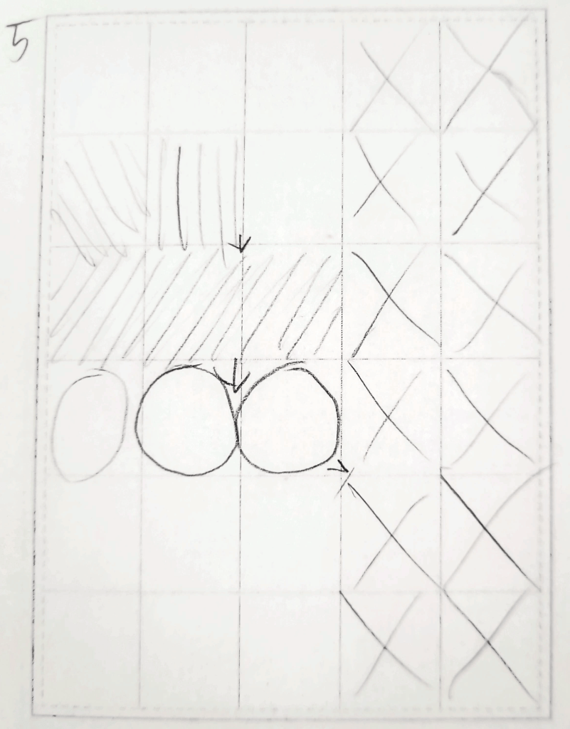
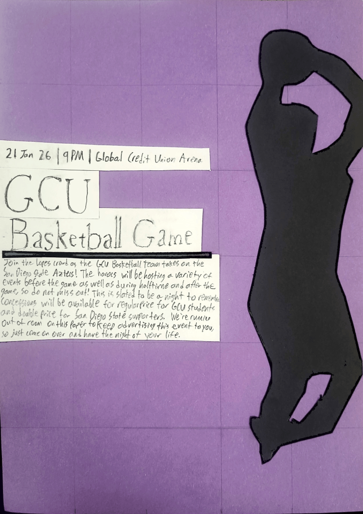
Today, I developed one of my grid layouts from my previous post into a full poster. Both the original layout and the final poster are below. The layout I chose left a lot of negative space open, which really emphasized the two main points of the poster: The silhouette of the basketball player and the “GCU Basketball Game” header. This grid layout helped me with decisions regarding hierarchy and placement by keeping me aware of where each item was supposed to be in relation to the grid. The grid was imperative to ensuring that the subheading and the body text were in an appropriate location that gave space to the header and even more space to the image.
One big thing that changed when moving from the rectangles to the text was the positioning of the text. In the original layout, both the heading and the subheading were different lengths, with the heading being longer and the subheading being shorter. However, when translating this design to paper, I found that the actual text stretched longer than anticipated on the grid, forcing me to wrap or extend some of the boxes. In the end, this assignment helped me to understand Swiss design principles by showing me how to not overcomplicate a design and place the emphasis on non-wording objects.

Leave a comment