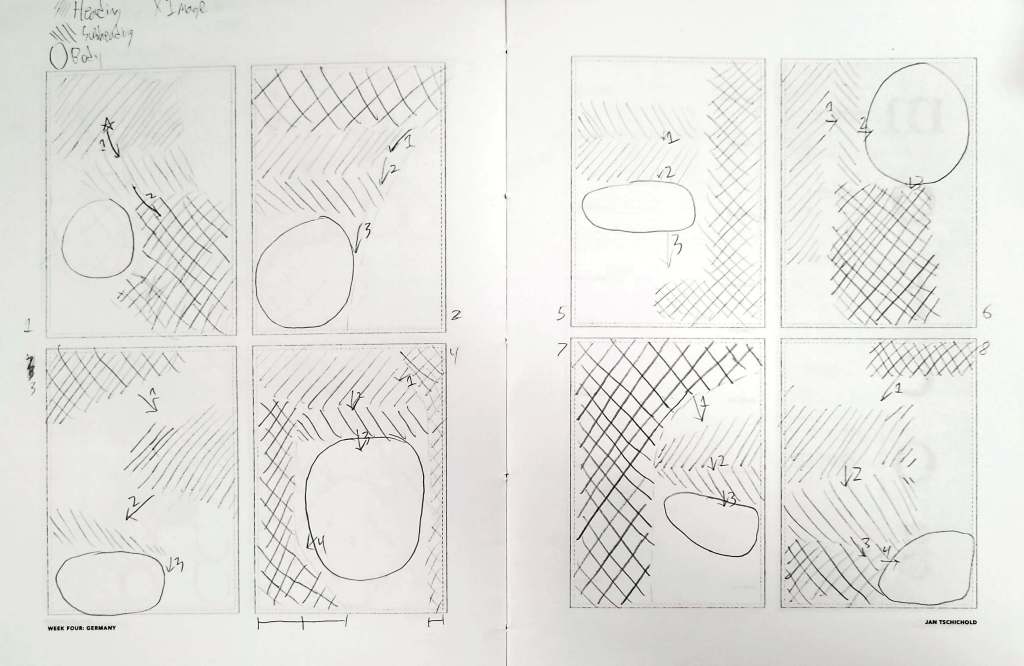
For today’s entry, I took the layouts from my first Switzerland post and applied some of Jan Tschichold’s design philosophies into them. These philosophies include the employment of asymmetry, contrast, and scale. For this exercise, I took the previously mentioned layouts and made them a bit more asymmetrical. This was done in a number of ways. For example, on number two, a curve was added to the design, which not only improved that asymmetry point but added a sense of motion to the design. Conversely, on design three, a zig-zag pattern was added, which added a fun amount of motion between the established hierarchy. Overall, Tschichold’s principles of design really help to a noticeable extent with composition. The idea of using scale to define hierarchy is extremely important in this series of designs and became a key aspect of all of these pieces. This property would help to more effectively communicate the point of each design. In the end, Tschichold’s designs make a point of typography being responsive, the design flexing around rules in order to serve the intended purpose of the design, and if these designs below were filled out I believe they would achieve this purpose.

Leave a comment